Something about vegetable illustrations with a slightly dated appeal is so satisfying to
look at. The black lines and sketch like quality when used harmoniously with color
is just beautiful. Though I decided not to color my "red radish", it would be red if I had.
Sometimes I think detailed lines are enough to compensate for the absence of color.
To top it all off, the names are handwritten in cursive with an occasional number for
reference that all looks so charming. I just really like it.
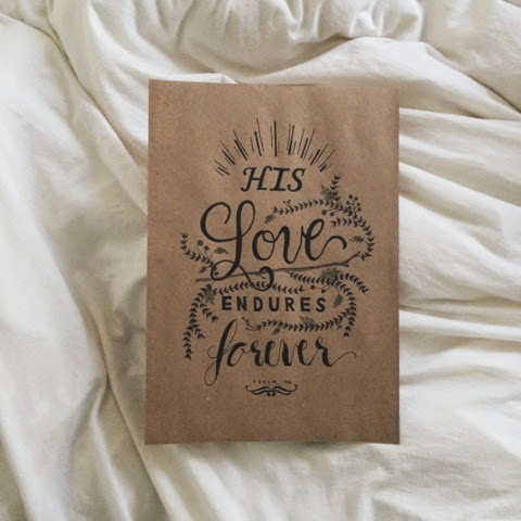
Jina and I signed up for a modern calligraphy class a couple weeks ago. We're just
counting down the days until this Saturday. We are so excited for this class and to get back
into nibs and ink.
We took a type design class in college where we designed our own typeface. Pretty neat.
Maybe I will post the font I designed and named Sea Salt when I am feeling less lazy.
It's fun to look back at past projects and remember the creative process it took, because
as nice as the final outcome can be, there's nothing more hearty and gratifying than the
actual process it took to get to the final piece. That's where all the magic and fun is.
Anywho, creating a font is a rigorous process I fully fathomed after taking this
class—much respect for type designers, much.
On a side note, I like slightly yellow, ivory, old-looking paper versus classic white.
Or something that has a slightly grayish tone, like newspapers—pretty much anything
but white. I feel like the color and tone of a paper adds tremendously to the overall
feel of the content and product itself. Others may think I'm crazy and ridiculous, but
I love paper, and details like this I find so pleasing when taken into account.


